Why Does The Duolingo App Look Weird? (Reasons & Easy)
Understanding the Change
It is common for users to feel frustrated when their favorite app suddenly changes its appearance, but you are not alone in this experience. Many users find the sudden shifts in UI, button placement, or even the famous green owl’s expression confusing or unsettling. This guide will help you understand why these changes occur and provide practical steps to manage your app’s appearance effectively.
Why Does Duolingo Look Weird Suddenly?
The primary driver behind a “weird” look is intentional design iteration. Duolingo frequently rolls out updates to its User Interface (UI) to optimize learning paths and increase engagement. These changes often include shifts in color schemes, animation styles, and navigation bars designed to keep the platform feeling fresh.
Additionally, the company utilizes A/B testing, a method where different groups of users see different versions of the app simultaneously. This helps developers gather data on which layouts lead to better user retention and learning outcomes. Occasionally, what appears to be a “glitch” is actually a planned experiment being tested on a specific segment of the user base.
Is This a Bug or Normal Change?
Distinguishing between a technical error and a design update is straightforward. If the app functions correctly—meaning buttons work, lessons load, and your progress saves—the visual change is likely an intentional update.
True bugs typically manifest as features failing to respond, the app crashing, or persistent error messages. If the app looks different but remains fully functional, you are likely witnessing a deliberate design evolution rather than a technical malfunction.
Reasons Behind the Visual Changes
- Recent App Update: Developers push updates regularly to introduce new features or address performance issues. These updates often include fresh visual assets that can make the app feel unfamiliar.
- UI Experiment (A/B Testing): As mentioned, Duolingo tests various designs. You might notice changes that your friends do not because you have been included in a test group.
- Settings or Theme Changes: Sometimes, internal settings or system-level dark/light mode preferences can alter how the app renders on your device.
- Device or Screen Scaling: Occasionally, issues with your device’s display settings or screen resolution can cause elements to appear stretched or misaligned.
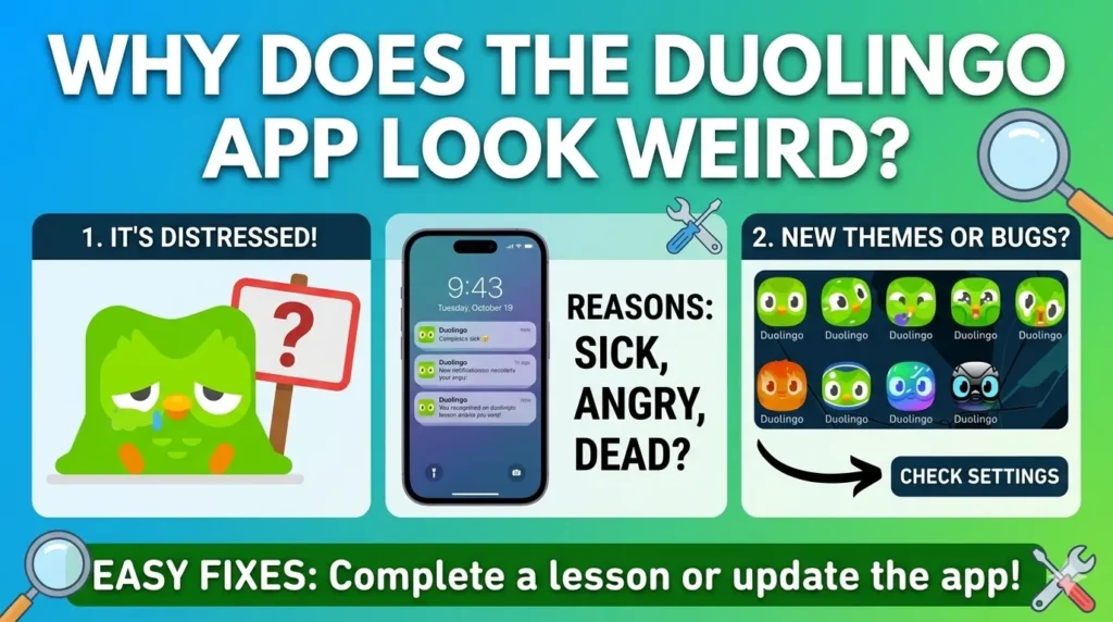
- Cache or Temporary Glitch: If an update was partially installed or files are corrupted, your app might display inconsistently.
How To Fix Duolingo If It Looks Weird
- Restart the App: A simple force-close and restart can often resolve minor display inconsistencies.
- Update the App: Ensure you are running the latest version by checking the Apple App Store or Google Play Store.
- Clear Cache: If using Android, clearing the app cache can remove temporary files that may be causing visual artifacts.
- Reinstall the App: As a last resort, deleting and reinstalling the app ensures a clean installation of the latest interface assets.
- Check Display Settings: Ensure your phone’s font size and display scaling are set to “default” to prevent layout issues.
Can You Get Back the Old Design?
Honesty is key: in most cases, you cannot revert to an older design. Companies like Duolingo move forward with new UI designs to standardize the experience and improve core metrics. These changes are permanent parts of the app’s evolution, designed to keep the platform competitive and engaging for all users.
The Truth About Experimental Designs
A/B testing is a standard practice in the tech industry. By showing different interfaces to different users, Duolingo can statistically determine which design is more “intuitive” or “effective”. If your friend sees a different icon or layout, it is simply because they are part of a different testing cohort, not because their version is “better” or “newer” than yours.
Frequently Asked Questions
Why did my layout change overnight?
It was likely an automatic background update or a server-side switch triggering a new UI test.
Is Duolingo broken right now?
Usually, no. Unless you cannot access lessons, it is likely just a design update.
Why is the icon distorted?
Icons change frequently as part of marketing campaigns or seasonal events to grab attention.
Why is the icon “sad” or “melting”?
These are strategic design choices meant to create emotional engagement and remind you to complete your lessons.
Can I change the icon?
If you are a paid subscriber, check your settings for a “Change App Icon” option to select from available variations.
Last Words
In summary, while the ever-changing face of the Duolingo owl can be jarring, it is almost always a sign that the company is actively iterating to keep the learning process engaging. Stay updated, keep the app current, and remember that these visual shifts are part of the broader, intentional effort to keep your language journey exciting.